battle of the wallpapers--opinions needed!
Jumat, 11 Oktober 2013
0
komentar
remember my teeny tiny vestibule?

well, i am having an enormously hard time deciding which wallpaper to put in the space.
what i want:
something neutral, that introduces some texture and or pattern that will look nice with the ornate mirror.
here are the top contenders:
option A:
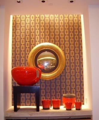
phillip jeffries grasscloth with a chain link stencil applied on top.


the good:
it will be really affordable.
let me clarify! because if you have ever looked at the pricing of philip jeffries wall coverings, you know it is pretty expensive. i purchased a small remnant of plain phillip jeffries grasscloth on ebay a few months ago for $50 to use on the ceiling of my powder room, but it is enough to cover this space as well. i also already have the stencil, although the scale of the links is larger than in the actual wallpaper.
the texture will be nice in the small space, and the link pattern will be a nice contrast to the ornate mirror.
the bad:
i have to stencil the grasscloth, which could be a pain in the butt. i might end up ruining it.
i have never hung grasscloth, so i would have to spend some time researching the right way to hang it. i might end up ruining it. can you tell that i am a little afraid to RUIN it?
option B:
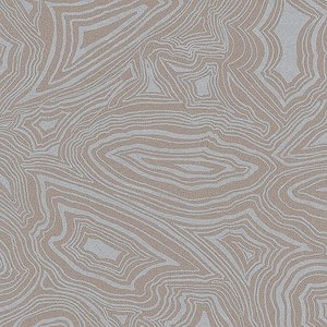
fornasetti malachite wallpaper in beige, cole + sons.


the good:
its a gorgeous wallpaper that i have had my eye on forever. it would be a subtle, chic look in this tiny space. it has a slight metallic sheen to it which is really dreamy.
the bad:
i would have to buy it, and most places have a 2 roll minimum, even through i only need one roll. a single roll is around $150.
maybe it is too subtle for this area? i could also use this paper somewhere else in my house, like on the ceiling in either my office or the foyer.
option C:
thibaut alexander wallpaper in metallic pewter on beige


the good:
its a great combination of texture and grahic pattern, plus it is a little traditional and a little modern at the same time.
the bad:
uh...close to $400. just to cover this one little area. a definite splurge.
option D:
farrow and ball ranelagh


the good:
this is a very classic, nice looking wallpaper with a soft graphic trellis motif. i can get it for a pretty affordable price. it would look nice against my scrolly white mirror.
the bad:
it may not be as "exciting" or design forward as the other choices.
ACK!
so, what should i do?
go with option A, the affordable, possible-train-wreck in the making diy stencil on the grasscloth?
or splurge on B or C?
or go with budget friendly option D?
here are the choices again:

help!!
what do you think?
please leave a comment!


well, i am having an enormously hard time deciding which wallpaper to put in the space.
what i want:
something neutral, that introduces some texture and or pattern that will look nice with the ornate mirror.
here are the top contenders:
option A:
phillip jeffries grasscloth with a chain link stencil applied on top.
the good:
it will be really affordable.
let me clarify! because if you have ever looked at the pricing of philip jeffries wall coverings, you know it is pretty expensive. i purchased a small remnant of plain phillip jeffries grasscloth on ebay a few months ago for $50 to use on the ceiling of my powder room, but it is enough to cover this space as well. i also already have the stencil, although the scale of the links is larger than in the actual wallpaper.
the texture will be nice in the small space, and the link pattern will be a nice contrast to the ornate mirror.
the bad:
i have to stencil the grasscloth, which could be a pain in the butt. i might end up ruining it.
i have never hung grasscloth, so i would have to spend some time researching the right way to hang it. i might end up ruining it. can you tell that i am a little afraid to RUIN it?
option B:
fornasetti malachite wallpaper in beige, cole + sons.

the good:
its a gorgeous wallpaper that i have had my eye on forever. it would be a subtle, chic look in this tiny space. it has a slight metallic sheen to it which is really dreamy.
the bad:
i would have to buy it, and most places have a 2 roll minimum, even through i only need one roll. a single roll is around $150.
maybe it is too subtle for this area? i could also use this paper somewhere else in my house, like on the ceiling in either my office or the foyer.
option C:
thibaut alexander wallpaper in metallic pewter on beige


its a great combination of texture and grahic pattern, plus it is a little traditional and a little modern at the same time.
the bad:
uh...close to $400. just to cover this one little area. a definite splurge.
option D:
farrow and ball ranelagh


the good:
this is a very classic, nice looking wallpaper with a soft graphic trellis motif. i can get it for a pretty affordable price. it would look nice against my scrolly white mirror.
the bad:
it may not be as "exciting" or design forward as the other choices.
ACK!
so, what should i do?
go with option A, the affordable, possible-train-wreck in the making diy stencil on the grasscloth?
or splurge on B or C?
or go with budget friendly option D?
here are the choices again:

help!!
what do you think?
please leave a comment!
Baca Selengkapnya ....


